Between customer data, transaction details, usage analytics, industry data, and more, businesses are awash with information. But raw data is just the beginning. To truly unlock its potential, businesses need to transform it into actionable insights. This is where data visualization comes in.
By effectively presenting complex data in a visual format, organizations can make informed decisions, identify trends, and uncover hidden opportunities. This comes into play in many ways in custom software applications—from giving users important data in easy-to-digest ways to analyzing your own data for informed decision-making.
Our clients use data visualization in many different ways in their custom software applications. Let’s look at a few. This variety is still just a pinch of the full possibility of data visualization in custom applications.
Looking for a Software Development Partner?
Learn what to look for and how to find the right fit.
Mortgage Maps and Tables
Longtime client and Far Reach partner iEmergent uses data visualization in everything it does. Its industry-first mortgage forecast mapping platform, Mortgage MarketSmart, pulls in data from various sources to help lenders build growth strategies and find opportunities in diverse mortgage lending.
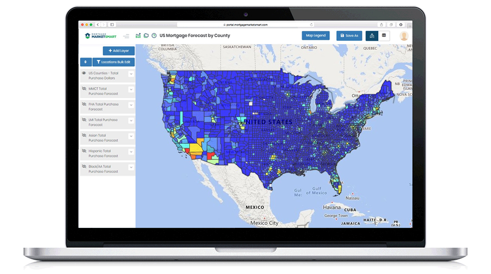
Much of iEmergent’s data is based on geography, so displaying information on maps was a no-brainer. Mortgage MarketSmart allows users to display any dataset on a map and customize it by geography, segment, and more.
Here’s a map of U.S. forecast data by county.
The dynamic mapping tools allow users to zoom in on the geography they care about. For example, here’s a map of forecasted loans in the Orlando mortgage market, shown as a heatmap based on dollar amount.
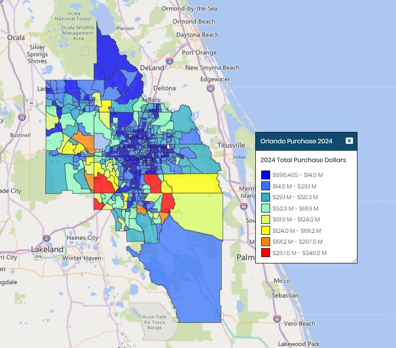
Mortgage MarketSmart users can quickly see where opportunity is in their markets and use other tools to build actionable strategies for capturing those loans.
More Maps for Seed Hybrid Reporting
Maps are powerful visualization tools, which may be why we have multiple clients that use dynamic maps in their custom applications.
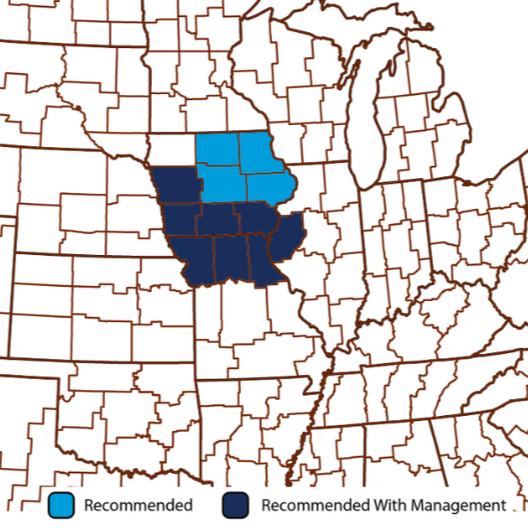
One of our clients has a custom system that displays various data points for seed hybrid variations. One of the pieces of data that’s important to users is where the seed hybrid performs well. The system uses maps to show regions where a seed varietal is most likely to be successful.
Read about how we implemented a simple .NET solution to make managing these maps easier.
Digital Product Catalogs
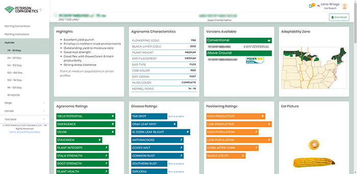
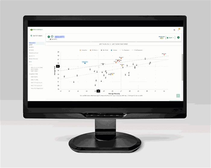
Peterson Genetics, Inc. and Peterson Corn Genetics both worked with Far Reach to develop digital product catalogs to display data about their hybrid seed varieties. These catalogs show everything from variety overview and agronomics characteristics to disease ratings and ideal geography.
While their systems are separate and show data for different crops, they started from the same foundation: Show potential customers detailed, up-to-date, easy-to-understand information about seed varieties.
Within each product catalog are dozens of examples of data visualizations. For example, here is what a sample variety dashboard page looks like in Peterson Corn Genetics’ portal:
And here’s a graph showing detailed comparisons of seed varieties in Peterson Genetics, Inc.’s portal:
Read more about the Peterson Genetics, Inc. portal and the Peterson Corn Genetics portal.
Interactive Progress Tracking
The Launch Fundraising platform helps school sports teams raise money in a fun, competitive, gamified way. The system has a lot of different data points to show and several audiences to show them to (coaches, athletes, reps, donors). Making this data easy to consume is important for engagement with the platform.
Here’s an example of a fundraising page that shows fundraiser progress, donation activity, team stats, and more:
Read more about the latest Launch Fundraising updates.
Final Thoughts
These are just some of the many ways custom software applications can deploy data visualization tools to help users. By transforming raw data into compelling visuals, businesses can unlock hidden insights, make data-driven decisions with confidence, and gain a competitive edge. Whether it's identifying trends, spotting anomalies, or communicating complex information effectively, data visualization is the key to unlocking the full potential of your software.
Do you have data that could be better used if it were visualized? Reach out.