User experience. UX.
It’s easy to define. (How an end-user perceives an app—before, during, and after using it.)
It’s hard to describe. (“It just works well.”)
It’s best understood when you experience it. (“I know it when I see it.”)
The next best thing is to illustrate it. Here’s an example of mobile UX.
This is the tale of two mobile apps: Noisli and White Noise.
Both mobile apps provide the same product—white noise—which I find helps me concentrate when I write.Their user experiences, however, are as different as night and day. Or the difference between a quiet, bubbling brook and noisy rush-hour traffic, you might say.
Surprisingly, the reason I prefer one to the other has nothing to do with why I bought it in the first place—white noise.
Instead, it has everything to do with my experience using them.
Noisli is simple.
I love the Noisli mobile app. I use it every day. I appreciate its “less is more” approach. There are 16 sounds. It’s just the right amount—not too many, not too few. I’m encouraged to dive right in and try one.
An icon represents each sound. It’s easy to tell what sound each icon represents at a glance.
The icons are spread out over three screens. This makes reviewing the options more manageable.
Selecting a sound is intuitive, and it’s easy to see if the sound is on or off. Touch an icon and the sound turns on. Touch it again and the sound turns off.

Combining sounds is intuitive. Click two or more icons to combine the sounds.
The design is beautiful. It does its job and it’s aesthetically pleasing. That adds value.
White Noise is complex.

As for White Noise, I abandoned it after only one use. I found the visual clutter distracting. Isn’t the point of the app to help me concentrate?
There are 40 sounds. The number of choices is overwhelming. I don’t know where to start.
A photo and words represent each sound. Using both seems redundant.
The sounds are all on one screen. So you have to scroll, and scroll, and scroll some more to see the complete list.
Selecting a sound is intuitive. Click on the photo and words and the sound turns on. Click on them again and the sound pauses. But, on the Sounds screen, it’s hard to see if the sound is on play or pause.

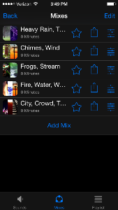
Combining sounds isn’t intuitive. To combine sounds, you have to go to a separate page—Mixes.

The design is utilitarian. It does its job, but that's it.
Why user experience matters.
You could ask why, in this example, user experience matters at all. After all, I already purchased both apps. Both companies have already profited from me.
However, which product am I likely to give a positive review? Which product am I likely to recommend to friends—both online and off? Which company am I likely to purchase other products from?
And which product has the most perceived value? I found Noisli a bargain at $1.99; White Noise, on the other hand, was $4.99 too much.
UX testing is the only way to know for sure.
This was my experience with these two mobile apps. Yours may differ.
For example, you may prefer 40 sounds rather than 16, one Sound screen to three, or photos to icons.
The only way to know if your mobile UX is truly effective is to conduct UX testing. When you do, focus on trends, not individual answers.
If one person has an issue, it might just be them. If many people have the same issue, it’s probably the user experience.
But if you don’t ask, you’ll never know. And, as you can see above, user experience can be just as important to an app's success as the problem the app solves.