One of my favorite things to do at Far Reach is work with companies like iEmergent to help them build a product like Mortgage MarketSmart. The Far Reach team
played many roles in this project, but my focus was on
web app development—building
the application. One of the most important aspects of building a product is usability. In this post I discuss some of the features and usability decisions we made when developing the application.
Before jumping to the features, I want to review a little background about the idea behind Mortgage MarketSmart. The old business model for iEmergent was to provide maps and a spreadsheet to their clients via mail, email or FTP. The forecast
data provided was invaluable to their clients, but the delivery method was far from perfect. Some of the challenges of this model included:
- Maps were static. Clients could do some basic functions within the map, but could not customize the map or do any symbolizing of the data.
- The delivery channel was via mail or FTP server. Maps were burned on a DVD and mailed to the client. Large spreadsheets were sent via email or FTP servers.
- It was impossible to scale. You can only manually create so many maps and spreadsheets without adding a lot of staff.
The solution?
Mortgage MarketSmart! Mortgage MarketSmart is a web-based software as a service (SaaS) solution that provides clients access to interactive maps, tables, tools, and
easy-to-understand market data.
During the design and development of Mortgage MarketSmart, one of our top priorities was making this a tool that is easy to use. Usability was top priority in all phases of the design and development. Some of the goals/ideas for this application
include:
- Clients should be able to "visualize their data."
- Usability takes priority over functionality. However, for the most part, we were able to iterate to have the functionality we wanted and still have great usability.
- Only provide tools and features that are necessary. This goes toward the minimal viable product (MVP) approach and helps keep the user interface (UI) from getting cluttered.
- Treat each piece of the application as a work of art. In Seth Godin's book, The Icarus Deception, he spends a lot of time talking about your work as art. I treated
each widget, button, and popup window as a small piece of art that collectively make one big piece of art.
Interactive Maps—Bringing Data to Life

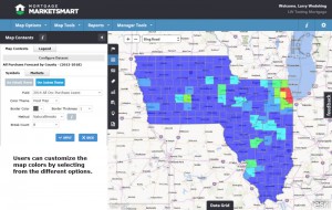
We knew from the beginning that the maps had to be the primary focus of the application. The maps are interactive and colorful,
and contain the data clients want to see. Using ESRI's ArcGIS software gave us the ability to create and implement awesome maps. With that in mind our goals for the maps included:
- Fast loading – Users would not want to wait a long time for a map to load.
- Interactive – We needed to make it easy to zoom in/out, pan, and draw on the map.
- Colorful – The map is full of data, and colors were important to help clients visualize the "hot" and "cold" spots. We implemented the ability for clients to symbolize their data with a color ramp of their choice.
- Clean – We did not want to clutter the map by putting floating windows on top of the map, so we implemented collapsible menus.
- Customizable – We allow different base maps (e.g. Bing Map, Bing Roads, Open Street) and other features that users can customize to meet their needs.
Navigation Panel

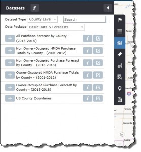
The ability to easily view and manage data and lists is important in any application. We spent quite a bit of time designing the navigation to work without violating
the goals of the maps. Our solution was a slide-out panel on the left-hand side of the application. This panel works well for several reasons:
- Users can show/hide the panel at anytime, which gives them maximum flexibility.
- The user is provided with a consistent experience.
- Each tab typically contains a single type of data and actions one can apply to that data (e.g. add/update/delete). Examples of the types of data include:
Data Panel

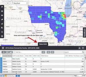
Viewing the maps is pretty cool, but part of the power of the maps is the data contained within the maps. To provide user access to this data, we implemented the data
panel. Similar to the Navigation Panel we did not want the data panel to interfere with the map, but wanted to give the user easy access to the data, so we implemented a slide-up panel at the bottom of the application. The user has the ability to show/hide
this data panel to retrieve data from the map. Some key features of the data panel include:
- Users can show/hide the panel at anytime, which gives them maximum flexibility in working with data and the maps.
- Each layer of the map can be viewed in the data panel by selecting from the list of layers within the data panel
- The columns shown in the data grid can be customized by the user—both the columns displayed and the column header labels.
- The data grid can be sorted by any column.
- The data grid can be exported to Excel format.
- The data grid can be searched—by any column—to help users find the data they are looking for.
- We provided different views of the data:


Map Tools—Selection Tools

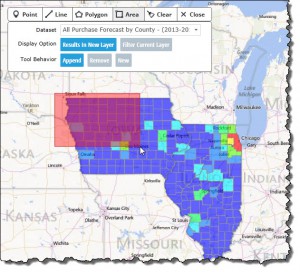
One of the goals of the maps is to make them interactive. The map selection tools add to the interactive nature of the
application. With these tools, users can draw on the map to select and create their own layers or to filter current layers. It really gives the user the power to customize the maps to fit their needs. Some key features of the tools are:
- The user can choose different types of tools when drawing on the map.
- The user can select which map layer with which to interact.
- The tool behavior gives the user the ability to add, append, or create new layers.
- The results of the tool can be seen in the map contents.
- The selection tools can be easily shown/hidden by selecting from the map tool menu dropdown or via keyboard shortcut.
We launched Mortgage MarketSmart in October of this year, but I still consider the application a work in progress. We will continue to re-evaluate usability and features based on user feedback, and will prioritize requests from both internal staff and
users, always making sure usability remains a high priority.
Here’s a video so you can see inside the application:
Interested in this software? Look for future blogs posts on the technical implementation of Mortgage MarketSmart using ArcGIS.